JL Luxury Time & Diamond
Identity Rebrand
JL Luxury Time & Diamond set out to refresh its identity while maintaining the brand’s prestige and reliability.
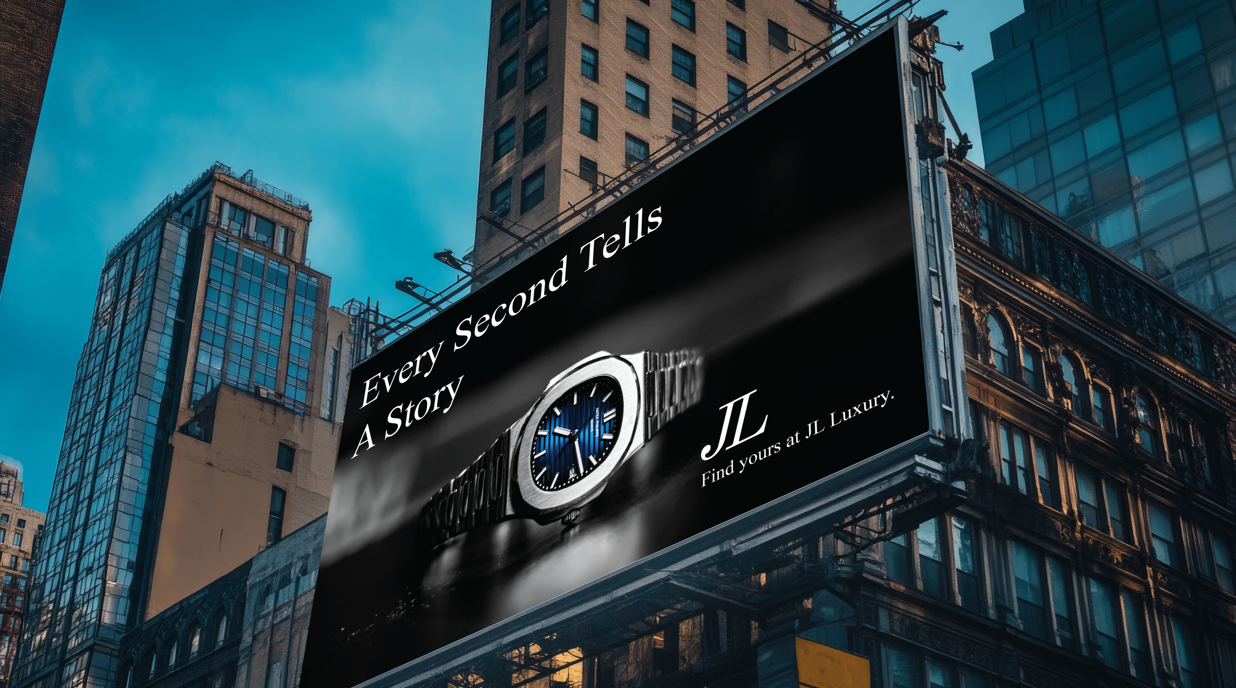
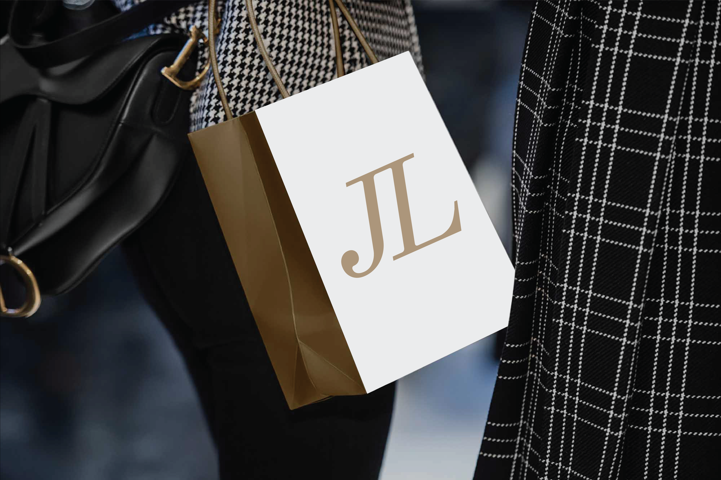
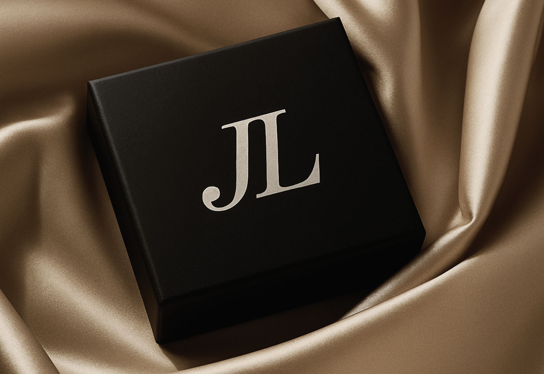
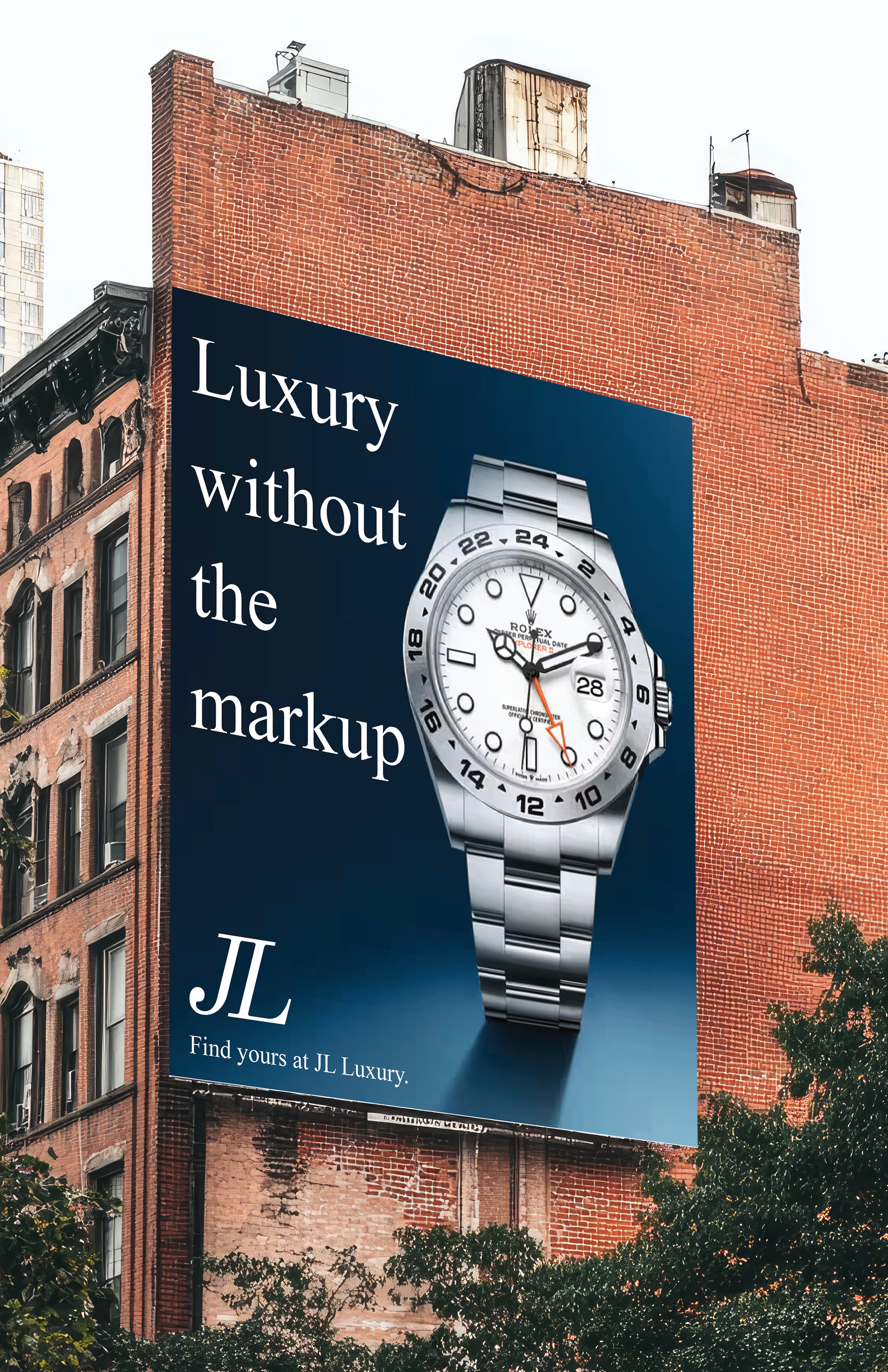
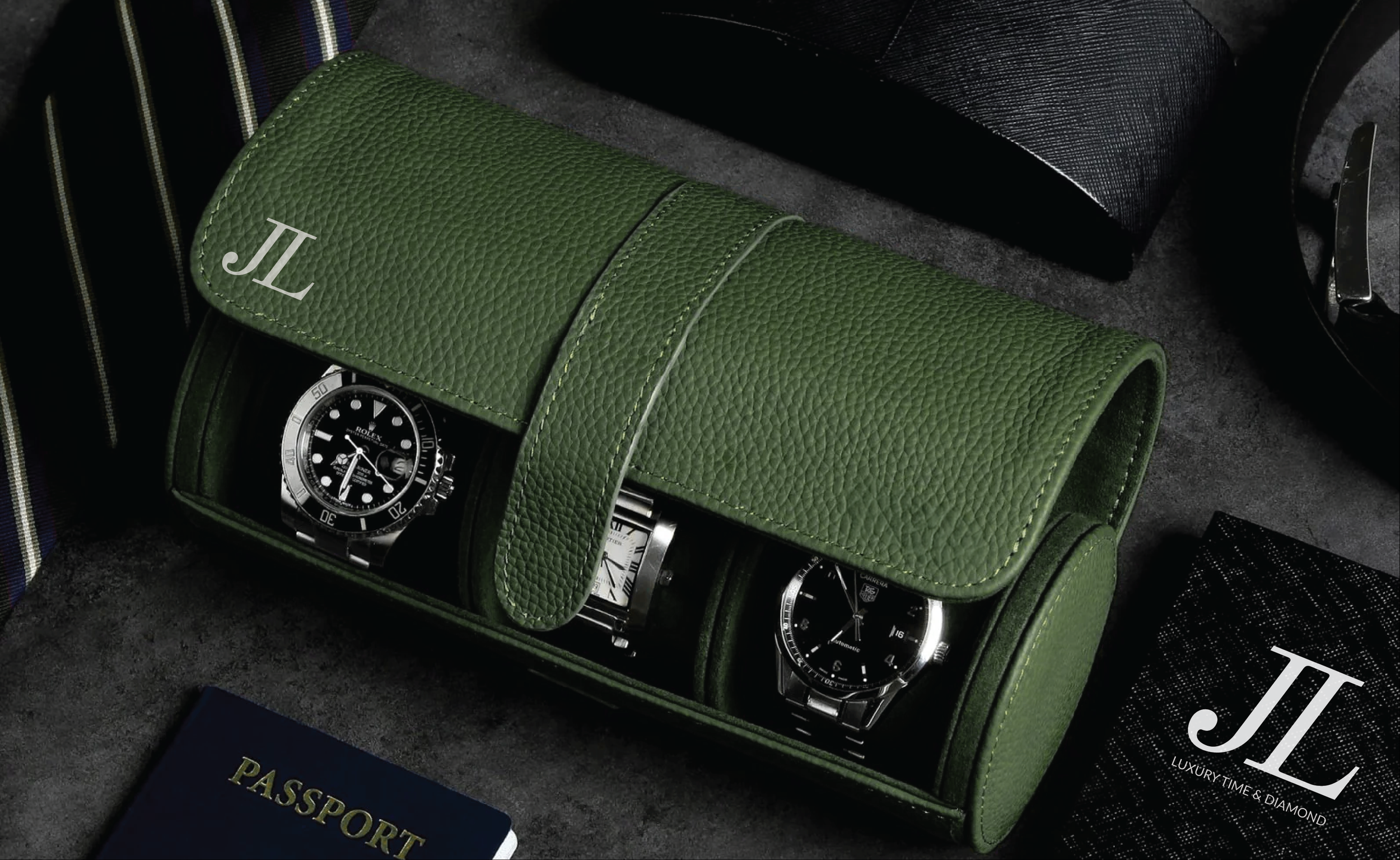
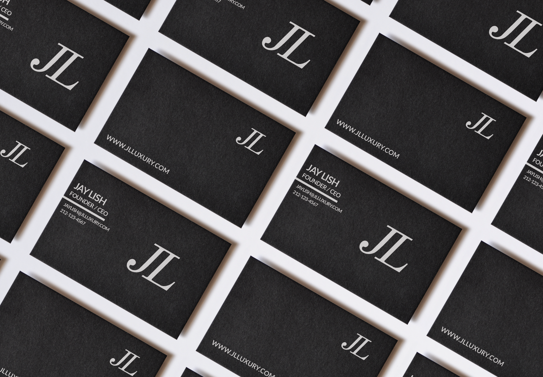
The rebrand creates a clear, cohesive look across print and digital platforms, one that feels refined and true to the brand’s values.
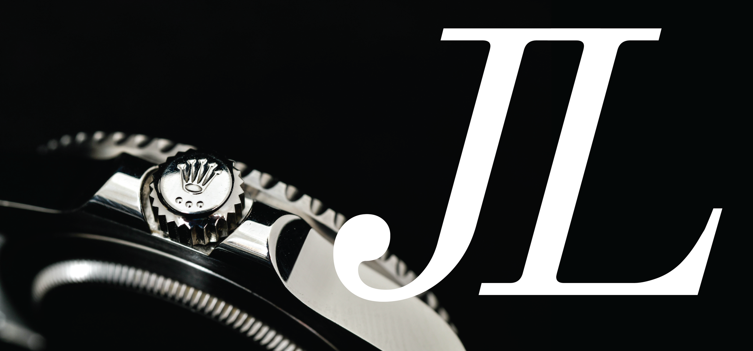
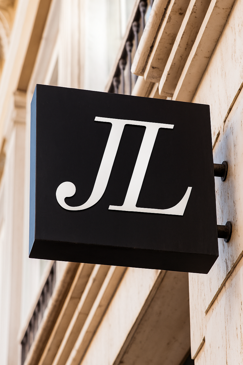
The original logo was hard to read and felt outdated. Its rough design didn’t reflect the brand’s quality or connect with today’s audience.

The goal was to build an identity that better represented elegance, clarity, and lasting quality.
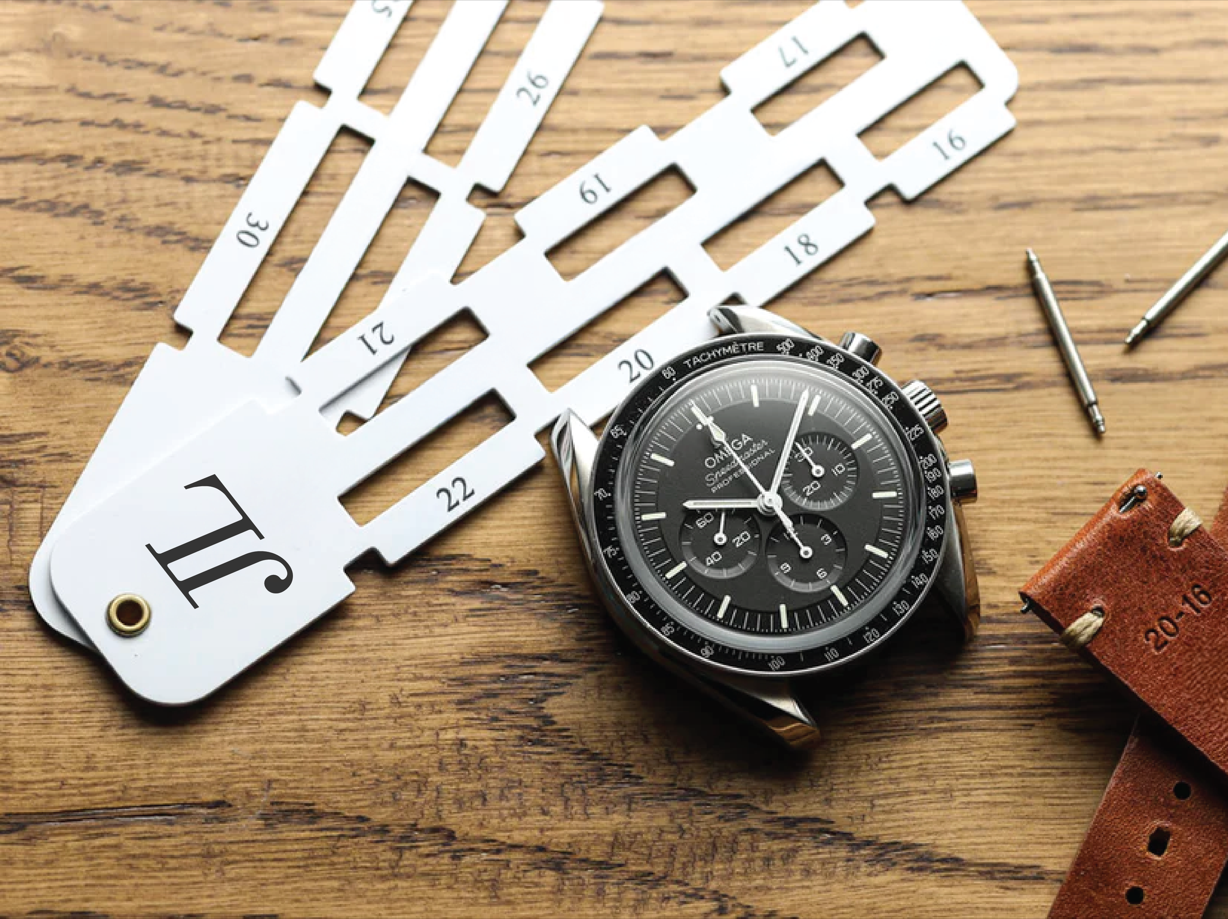
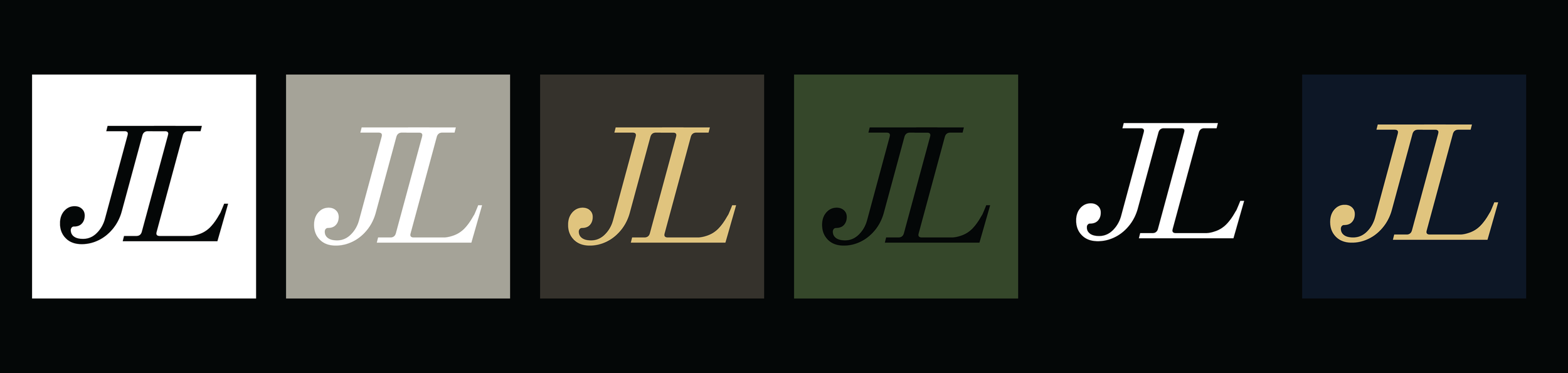
The redesign focuses on simplicity, balance, and refined detail.
Clean typography, generous spacing, and a neutral color palette create a refined visual language that highlights detail and craftsmanship. Every element was considered to reflect the confidence and simplicity of true luxury.

The JL Luxury rebrand revitalizes the brand’s image while preserving its heritage of quality and trust.
The result is a timeless identity, confident, minimal, and built to resonate with both loyal clients and a new generation of watch enthusiasts.