Dancing Moon
Identity Rebrand
Dancing Moon is an artisan soap brand centered on handcrafted quality and natural materials. This rebrand modernized the visual identity while preserving the brand’s calm, intentional spirit.
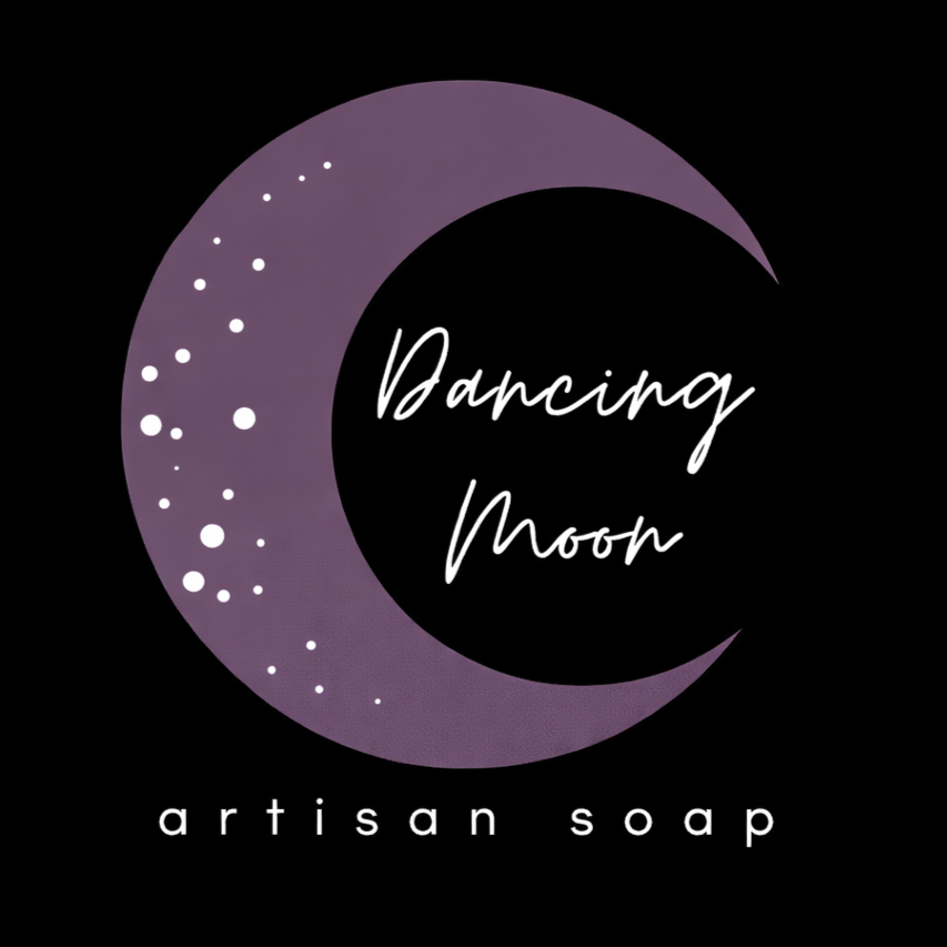
The previous branding felt dated and overly rustic, limiting its appeal in modern retail and digital spaces. The goal was to elevate the brand without losing its handmade character.
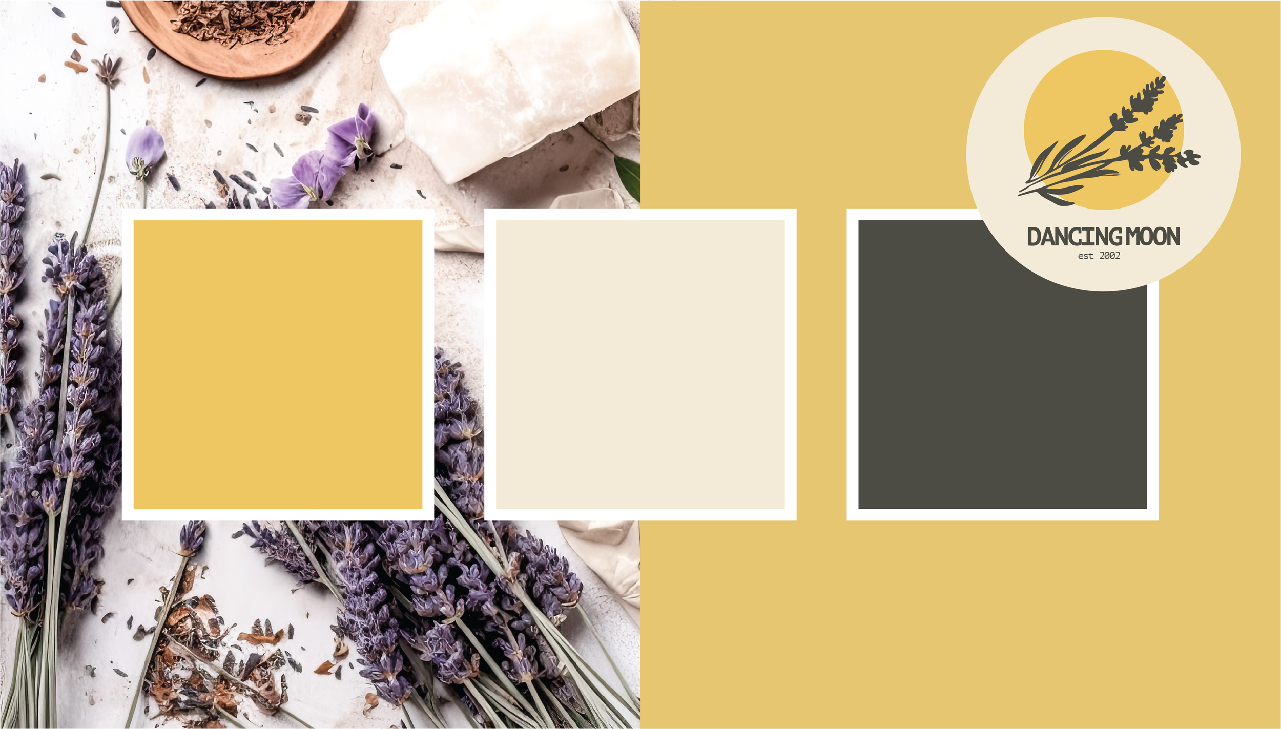
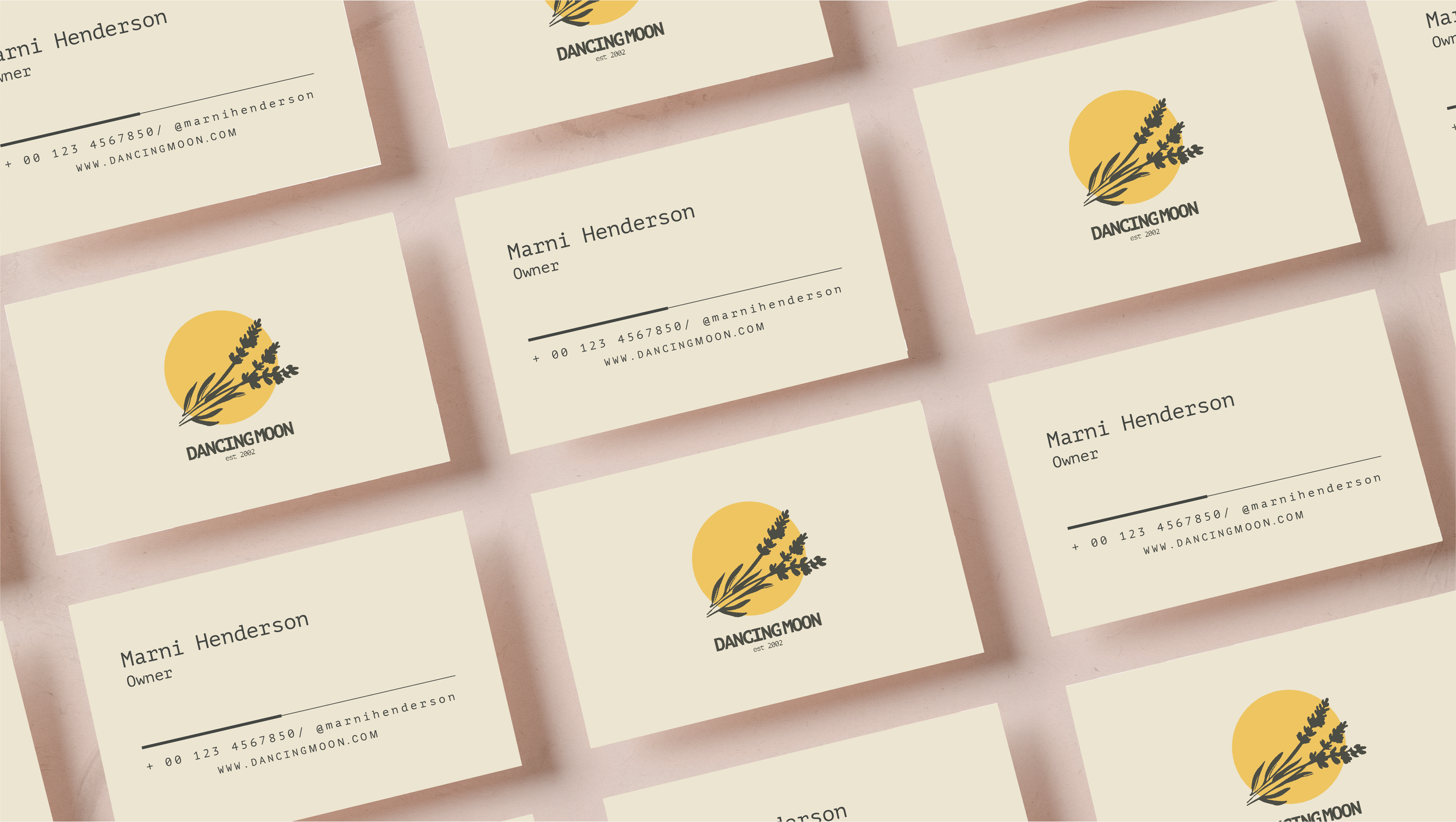
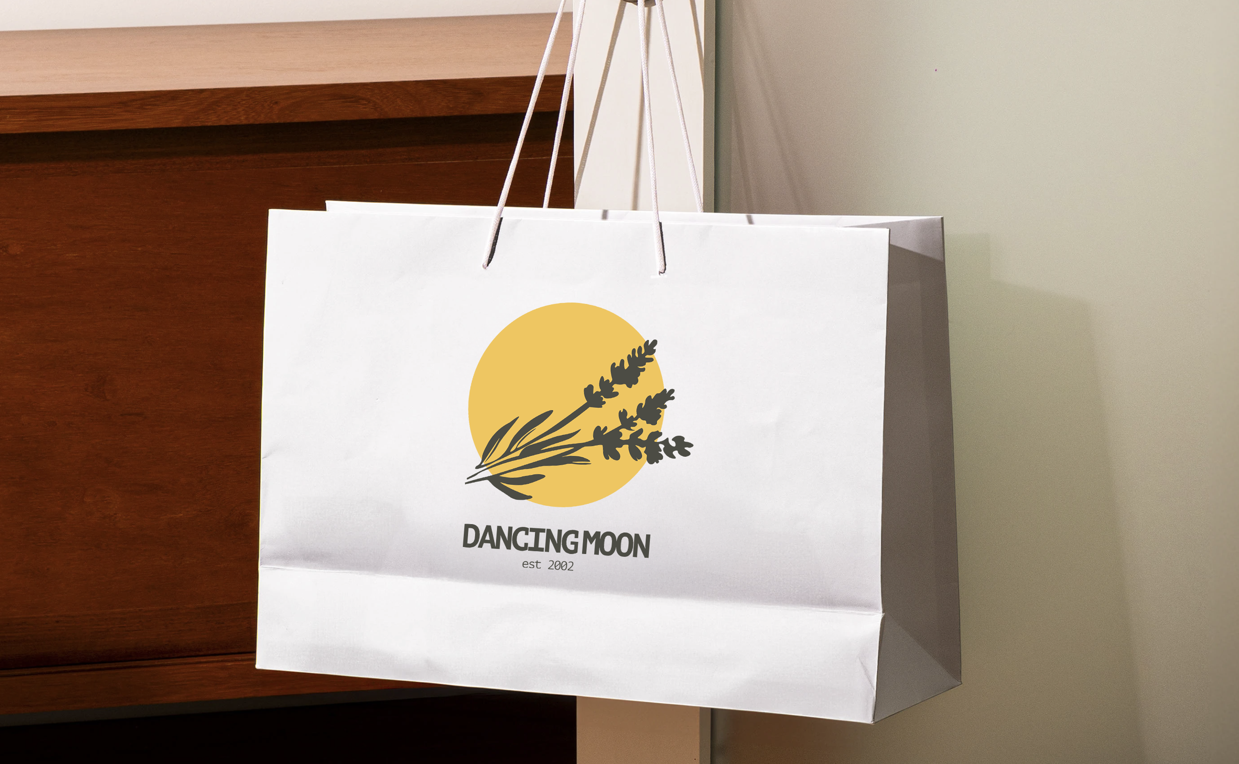
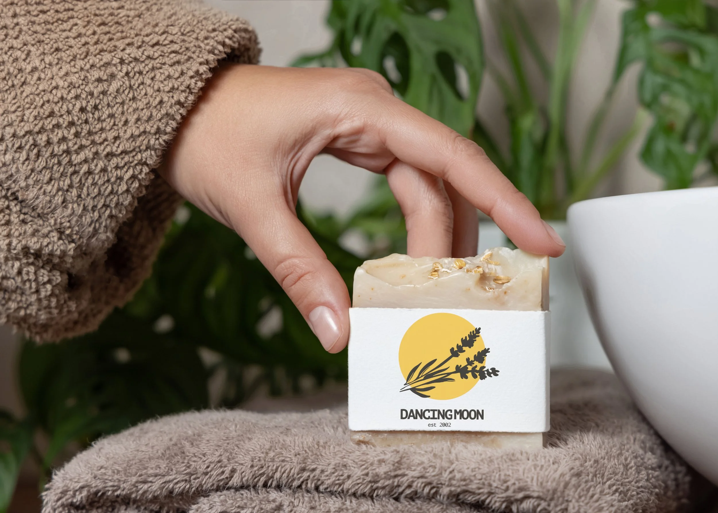
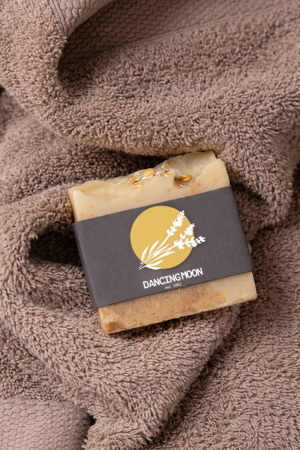
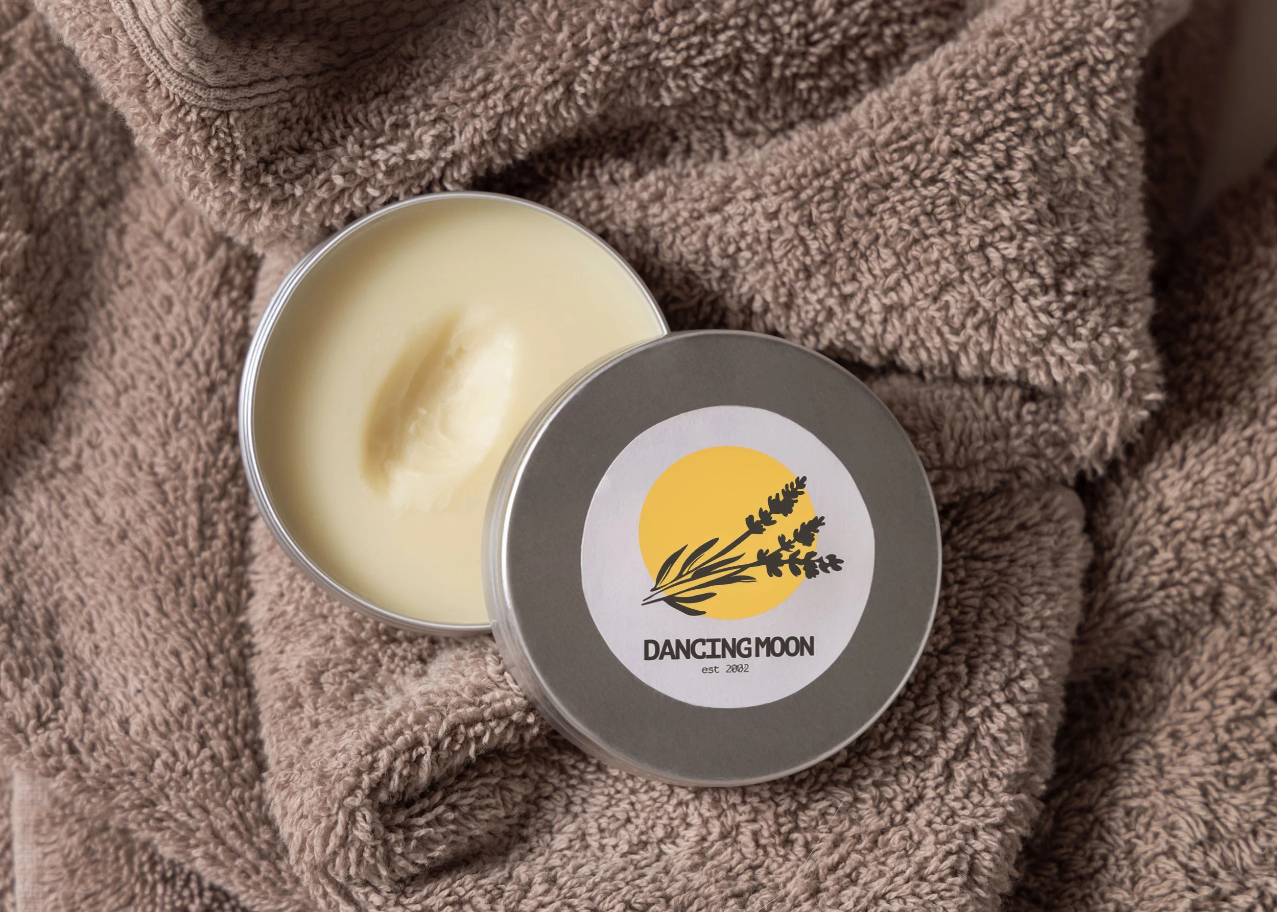
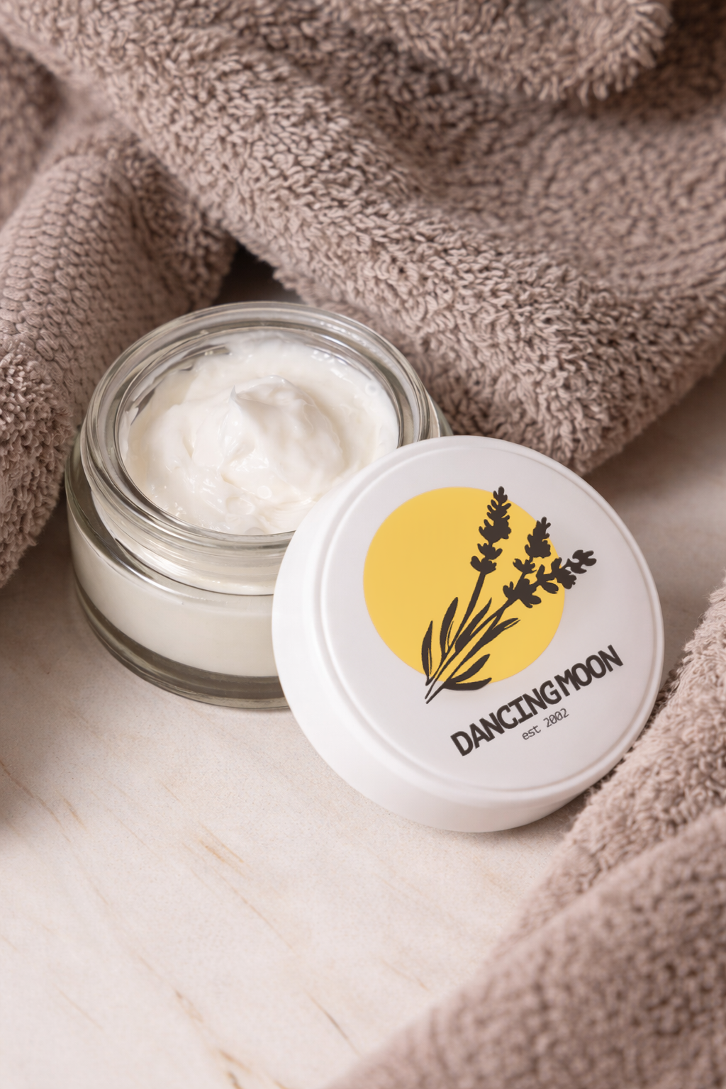
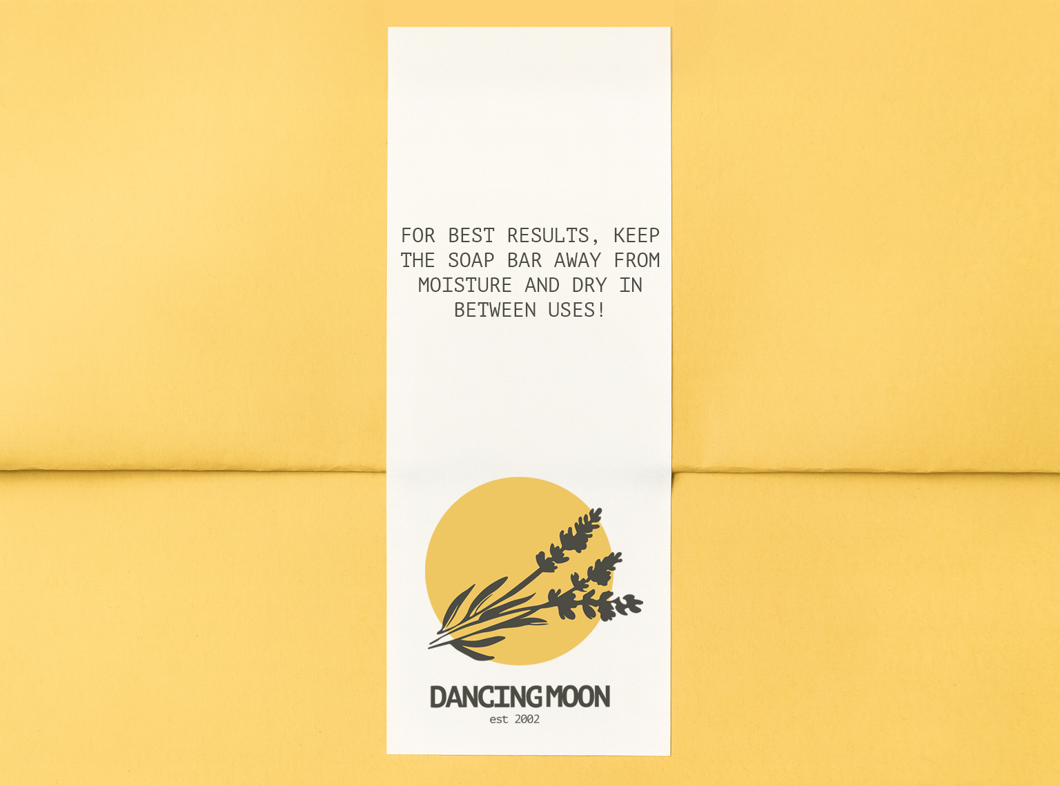
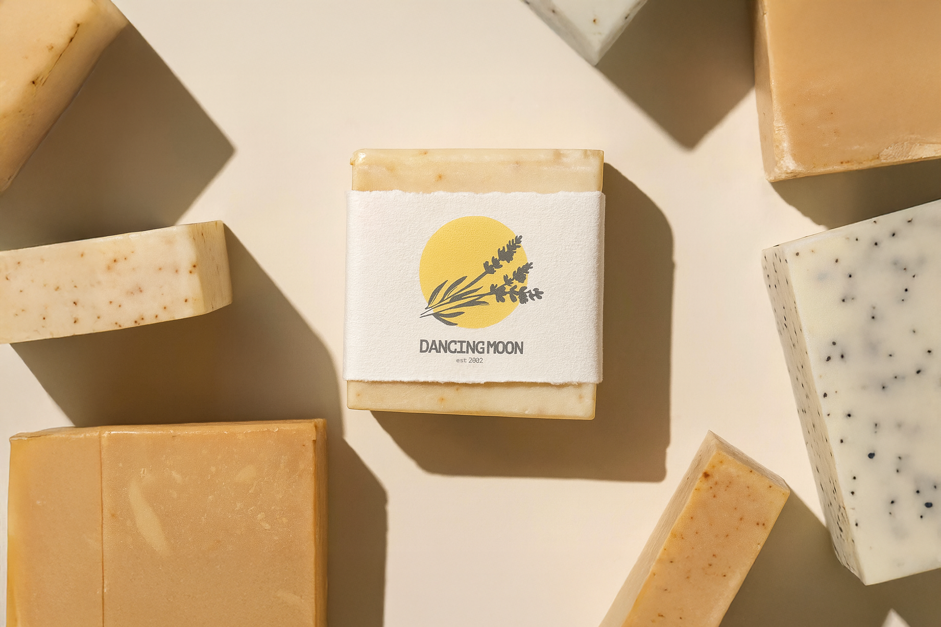
The new direction focuses on simplicity and balance. A muted, natural color palette, clean typography, and minimal packaging allow the product to remain the focal point.
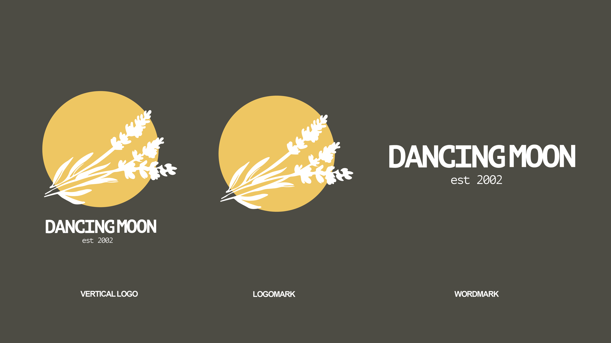
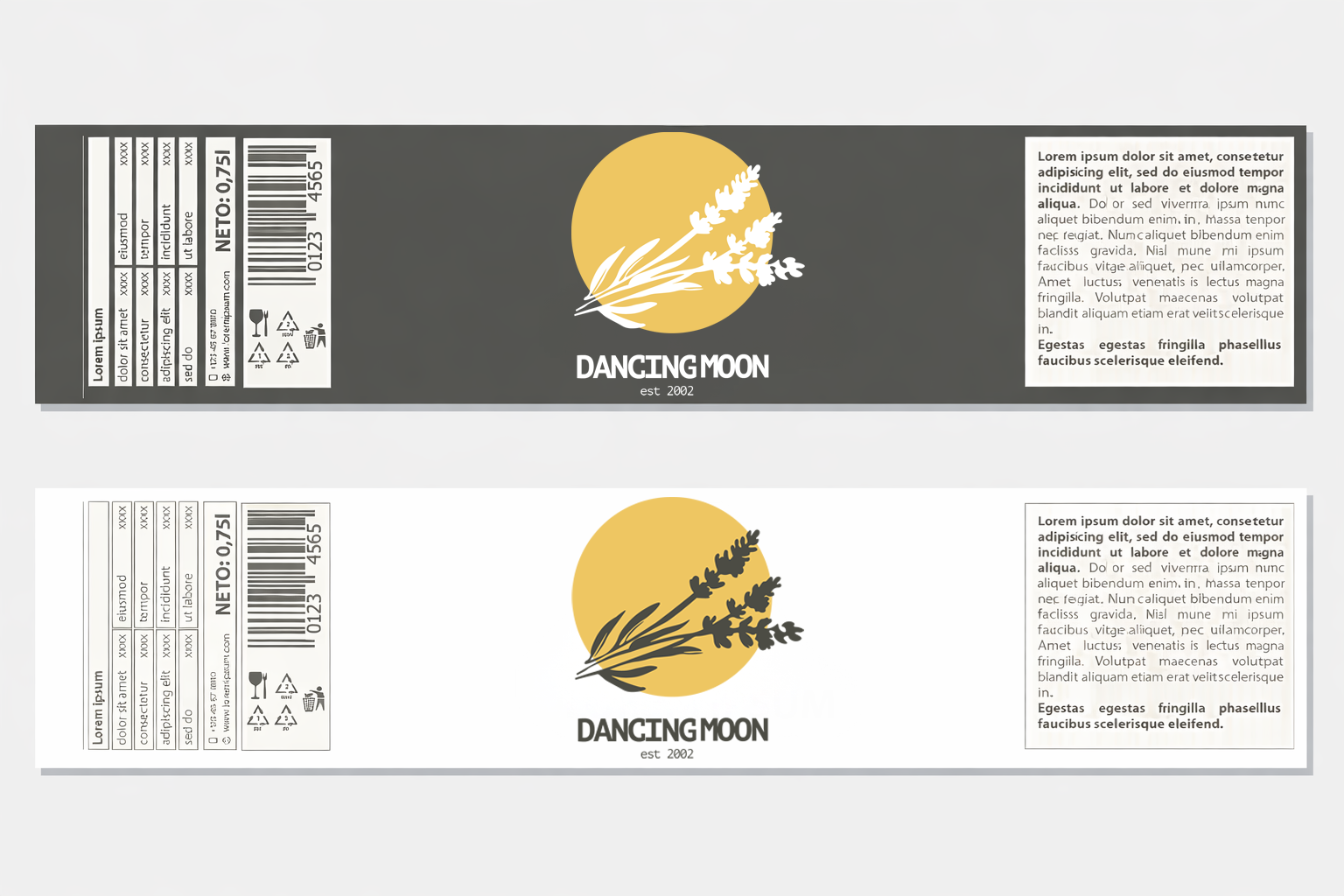
The updated logo is modern and understated, balancing structure with softness. It reflects Dancing Moon’s connection to natural rhythms while remaining versatile across applications.
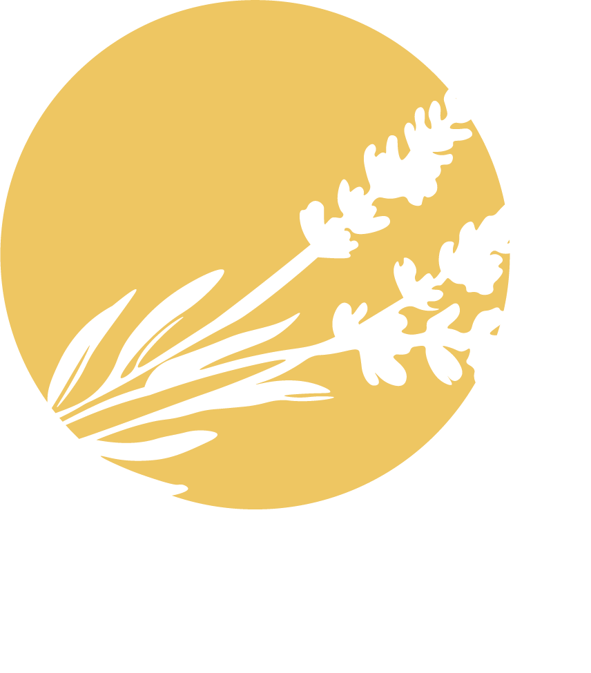
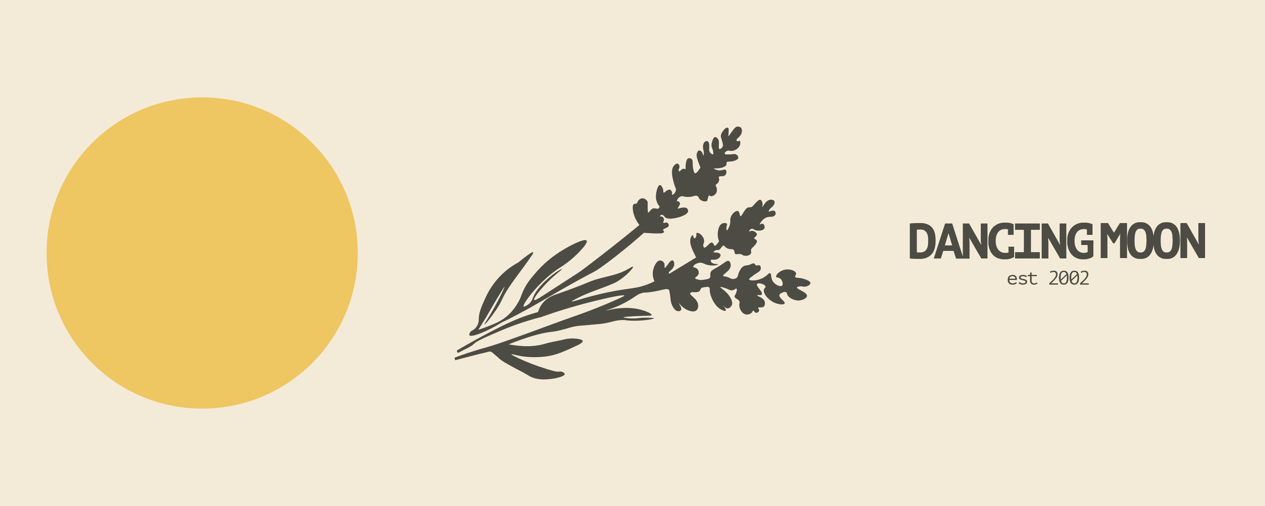
The Dancing Moon logo is inspired by movement, balance, and personal ritual. The moon symbolizes rhythm, change, and creative flow—shown in motion to reflect a sense of energy and evolution rather than stillness.
Lavender is woven into the mark to represent calm, care, and the owner’s deep connection to using lavender as part of everyday life. Known for its soothing and restorative qualities, it grounds the logo in wellness and intention.

Together, the dancing moon and lavender express a balance between movement and calm, creativity and care—capturing the heart of the Dancing Moon brand.